MoneyBird
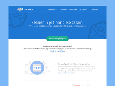
Had some free time this weekend and so I decided to take a look at the current website from a great financial Dutch online software startup called MoneyBird. They are growing fast and have a lot of satisfied Dutch costumers already.
To give them some inspiration and food for thought I designed a new homepage for them, in which I think their unique selling points stand out more and improves readability.
The great flat icon's I've used are from this awesome guy Norm
The awesome line icons I've used are from this great designer Jory
Don't forget to check out the attachment for the full view of this concept. The headlines used in this design are all Dutch, so if you want a better understanding of the content, please use this website. :)
More by Bart Ebbekink View profile
Like

