iPGA - Brand Mark Construction
iPGA's brand mark construction
--------------------
ABOUT
--------------------
International Professional Guardianship Agency - iPGA for short, is an agency that provides guardianship services to school-going children between the ages of 10 to 18 years old, who have been sent to Singapore to study.
--------------------
CONCEPT
--------------------
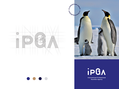
iPGA’s primary logo is a simple logotype formed by the initial of the brand name: International Professional Guardian Agency.
Every letter in iPGA’s logotype is custom-made. I’ve kept the "i" in a lower case because the brand is friendly, approachable humble beings where they always put their wards in their best interest.
The letter "G" stands for Guardian and the greatest emphasis is placed on it. iPGA's Guardians mirror the traits of an Emperor penguin because just like them, their Guardians are doting parents. The letter "G" shows a parent penguin in the negative space embracing its chick penguin in the positive space.
"A" represents a peak and it symbolises strength, confidence, adventure, and purpose.
Happy weekend guys and keep on creating!
--------------------
Like it? 🐧Let's work together!
