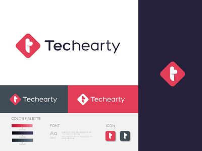
Techearty Logo and Branding
This is the project we recently completed with a local software company named "Techearty". They make web apps, WordPress plugins, etc. I hope you guys love it.
Story: The client wanted something modern and edgy. They wanted it simple, clean and timeless. They have T in their company name and that is the first letter. And we also have the keyword "Heart". So we tried in our best way to combine these two things. Finally, after long research, we found the best minimal way to present the logo mark.
We kept the red color because whenever we think about HEART and LOVE, we think about red. We kept two dark colors one of them is purple and another one is grey for the background. The logo will be used in a horizontal approach only. The logo primarily will be used on the website, stationery and office sign. In the future, they will also develop an application. So we had to keep in mind that the logo gets well fit as the app logo as well.
--------------------------------------------------------
For project inquiry email here:
brandoxideoffice@gmail.com
-------------------------------------------------------------
Website:
jahidme.com
------------------------------------------------------
Follow us here
Behance
Pinterest
Instragram


