Progress Indicator on Forms
🔍Progress indicators provide visible cues for users to refer to when progressing in a task. Since there are many different types of progress indicators, I'd like to focus on one that's used for form completion in this post 😁
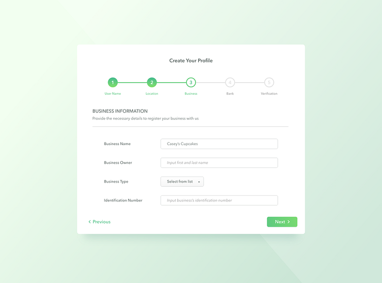
🟢This indicator promotes completion. A user is likely to complete a task if given visual cues that they're progressing
🟢States are clearly defined - Each step is associated with a numerical value and a title - Finished steps are filled in with green - Active screen is indicated with a green ring - Inactive/incomplete steps are indicated with light grey
🟢The main title should be the core task that the steps are going to accomplish, while the steps themselves act as category dividers to prevent clutters
🟢"Next" button should be defined as the primary action since you want users to proceed with the task
🟢When it comes to filling out forms, users would really appreciate the ability to go to the previous step for adjustment purposes
Yes, forms are undeniably boring 😩😩 But there are ways to make them a bit nicer to go through, such as this 😁 Since there are various form layouts, I'll conduct a study on them one of these days...
Hope you guys enjoyed this! 💚