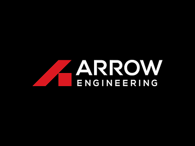
Arrow Engineering Logo
The Arrow Engineering logo mark features an abstract letter A inspired by fundamental structural shapes: the square and triangle. The understated logo mark remain broad enough to encompass all existing and future facets of the business.
The use of simple shapes with exact proportions communicates attention to detail, strength, and organization, portraying Arrow Engineering’s work as precise, intentional, trustworthy, and structurally sound. Similarly, the simple shapes evoke both the grid of graph paper as well as various drafting instruments such as a ruler and 45 degree triangle.
Additionally, the R's have been modified not only to provide increased distinction but also to compliment the sharp angles of the logo mark.
Ultimately, Arrow Engineering's logo mark provides the perfect blend of function and form, appealing to contractors and architects alike.
Examples of brand application in the attached gallery.
Created at Stewart Design.


