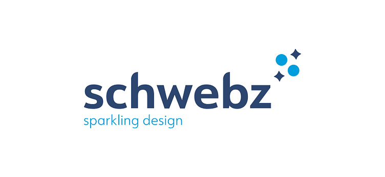
Logo Schwebz - Sparkling Design
I created this logo for Schwebz, a Belgian agency that specializes in Web design and Logo design. The inspiration for the name of the agency is ‘Schweppes’, the tonic drink. This is the connection with the ‘sparkling design’ tagline.
For the logo I used the word ‘sparkling’ as a starting point. If you consider the connection with the drink, bubbles would be appropriate to visualize the word sparkling. If you consider it in the meaning for sparkling design, then a spark, star would be more appropriate to use. I tried different approaches with both ideas, but ended up combining them to create the symbol for the brand. I used basic shapes: circles for the bubbles and star shapes to represent the sparks, and stacked them to form the letter S to reference to the brand name Schwebz. Also the use of basic shapes could serve as a reference to logo design, which is one of the main activities of Schwebz.
