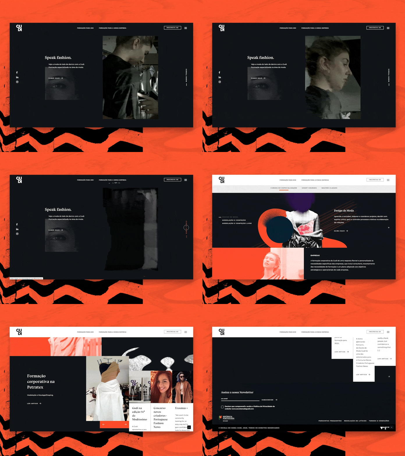
Gudi Homepage
Today we're giving you a sneak peek at the fashion-forward website we've developed for GUDI - a fashion school in Porto - with whom we've been working for some time.
To create a visually interesting palette, we threw bold feature colors amongst the more neutral tones. We used a base of black and white, but spice it up with a splash of orange and purple to reflect ambition, imagination, and innovation.
Finally, we dressed this website to kill with some morphing shapes and disruptive illustrations. 💥
More by Miew View profile
Like
