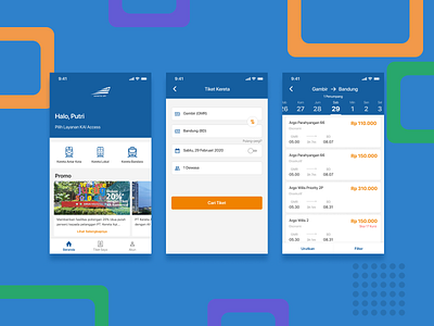
KAI Access Redesign
Hi, I can't sleep last night and here's the thing to get me tired and fall asleep.
I do redesign for KAI Access for iOS with Bahasa Indonesia on it, the reason why I'm doing the redesign is to get more KAI-nish with the main color is blue and the secondary color is orange (yeah, it's dominant blue).
You can duplicate these files on my Figma community. Check it out! www.figma.com/@abid
Have an amazing project?
Email me hanifussafly@gmail.com
More by Abid Hanifussafly View profile
Like
