Cryptocurrency Exchange - Mobile Views
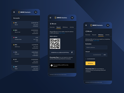
The goal with mobile was to retain the simplicity of the web UI and make it simple to navigate. For the web UI, we went with breadcrumbs and specific page URL's for a number of reasons including analytics.
For the account summary, I moved to a three row design to the right which is anchored by a single row effect to the left which I think gave the impression of less crowding.
