Mom's Chicago - Brand Development


Collaborating with renowned chefs Kelly and Randi on this project has been exciting from the beginning. When meeting with the Mom’s initially to talk design, direction and overall goals for the brand, Kelly and Randi were initially drawn to us for my hand lettering and frequent nods to feminism in my design work. We touched on the inclusion of Japanese feminism and wanting this to be integrated into the brands story.
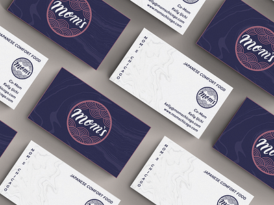
Going into the initial sketches, my goal was to blend this with the focus on Japanese comfort cuisine as well as reflect the professionalism of both Randy and Kelly’s experience as chefs. The final logo mark was decided on for it’s integration of the traditional Japanese “seigaiha” wave, this elevated the brands sophistication to match the Mom’s reputation, with addition of fun hand lettering with a little edge. For the lettering, we went with a thicker stroke to speak to the “comfort” food ethos.
After rounds of research, I chose to take the approach of traditional Japanese signage. Typically painted vertically on lanterns and through neon Signs of Honk Kong, I took these as reference landing on a friendly, approachable and rounded serif typeface for the Mom’s menu and secondary identity elements. The marble choice was a tie-in to another Japanese craft of water marbling, otherwise known as Suminagashi.
The lantern and the interior menu were hand painted.
