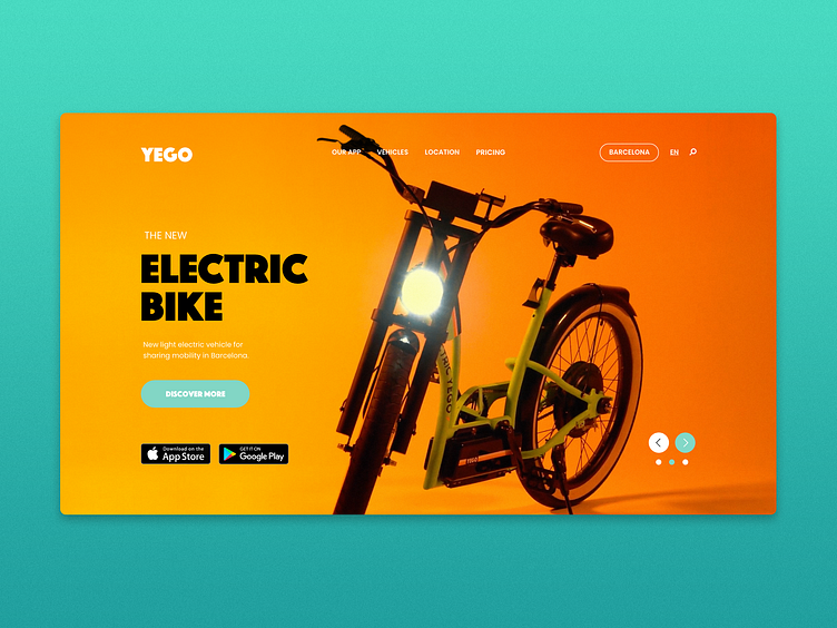
YEGO Urban Mobility - DailyUI#003
DailyUI #003 - This is the result of my third day of the Daily UI challenge.
The main goal was to design a landing page, I decided to play with the YEGO new vehicles. I’m a big fan of the company and the constant improvement of their products, the service is top-notch. Nonetheless, what I don’t understand is the visual inconsistency on their website and product. As a designer and consumer, I feel the lack of clarity and unity of their work.
The day I was walking around Diagonal (Barcelona) and I saw a new one YEGO Electric bike leaning against the wall, my first thought was: when are these bikes going to be launched? I’ve never seen it on Instagram or their app before… Today, I did my research about it and I’ve discovered that these new vehicles (Bike and Stand-up) were launched around December 2019, but I couldn't find anything easily accessible from YEGO, only two quick youtube videos…
That was the idea behind the landing page. Enhancing their UI and Branding I could focus in a campaign for their new products, having a user journey and CTA directly aimed at the download of their app.
