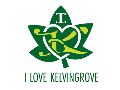
I love Kelvingrove branding
I am working on a number of proposals for branding to communicate Kelvingrove Park in Glasgow. The Park is trying to create an appreciation of the park as it has experienced some anti social activities. Kelvingrove origins are in the high point of Victorian era culture, so I used a Neo Gothic typeface for the letter K of Kelvingrove and combined it with a sycamore leaf to represent the green space of the park. I interwove a heart to represent the main message of the of branding and added a letter I in the same colour white, to link the letter I and the heart. i used two values of green to reinforce that the park is a lung to the West End of the City.
More by Alistair Devlin View profile
Like
