ProPair - Logo Design / Part 2 ✅
ProPair - Logo Design / Part 2 ✅
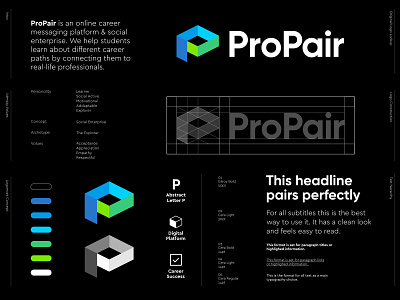
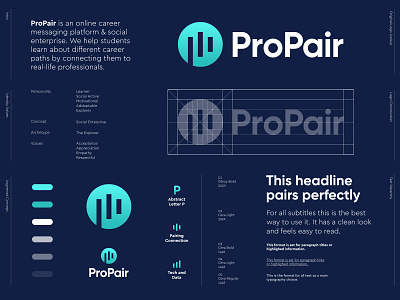
ProPair is an online career messaging platform and social enterprise. They help students learn about different career paths by connecting them to real-life professionals.
After receiving many helpful feedback on the previous concept the other day i decided to move a bit away from that current concept. Felt the music things was too much going on and decided to try something different.
There are many visuals references in this mark but still the mark looks clean and subtle to my eyes. I can totally see a leading line from the foot of the P symbol moving from below to the very core of the mark. There is the checkmark hidden as this could refer to a successful journey throughout someone's career. Still very abstract but meaningful enough to share it with you guys here.
Fun little extra, the shape looks identical to the known Graduation Cap 🎓
As always open to hear your thoughts and/or points of feedback.
_ _ _
Interested in working with me? Feel free to reach out:
info@jeroenvaneerden.nl www.jeroenvaneerden.nl


