BMF! #05 / WordPress
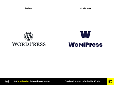
WordPress’ current logo is not so ugly but I think it deserved a refreshment.
WordPress is the most popular CMS platform in the world. The brand should reflects the leadership and carry a vision for the future of digital.
I chose to create a simple symbol that would mix the concept of the W letter, a king crown and an ink pen. This graphic element can be used as well as the first letter of the name. Everything is fully modular !
I decided to bring more vivid colors because I always thought the current palette was very austere.
I made WordPress a modern and dynamic brand !
FULL POST
www.instagram.com/p/B88eNmLgcYq
BRAND ME FAST!
www.instagram.com/brandmefast
@brandmefast
