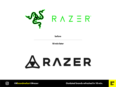
BMF! #04 / Razer
Razer's current logo is ugly and outdated. It is unbalanced, not modern and looks like an awkward tribal tattoo. I have always been disgusted by the brand only because of that big ugly « 3 snakes » element that would pop-up on my laptop.
I redesigned the font based on Montserrat and just kept the A that in my opinion is in representative of the Razer iconography. I used the A shape to create the logo icon, bringing it back to something more geometrical and technological.
FULL POST
www.instagram.com/p/B8g2sr7hgY_
BRAND ME FAST!
www.instagram.com/brandmefast
@brandmefast
More by BRAND ME FAST! View profile
Like
