BMF! #03 / Alibaba
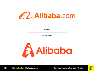
Alibaba.com logotype is one of the ugliest I have ever seen. Some would say that they don’t need a nice logo to succeed in their business. True. But I am a designer and my eyes are burning.
I first modernized the font with something more compact and geometric, getting rid of the .com to gain space and thus, legibility.
I replaced the ugly face in the icon element by the figure of a smiling Moaï. When I think of Alibaba I think of treasures so I thought the Moaï face could be a good fit between old logo style and meaning. I shaped the face in a big cap A that gives more strength and contrast.
FULL POST www.instagram.com/p/B8Ngx3xA3Rw
BRAND ME FAST! www.instagram.com/brandmefast @brandmefast
