BMF! #02 / Carrefour
BMF! #02 / Carrefour
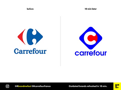
Carrefour's logotype was designed in 1966 by Jacques Daniel (not Whisky one) in collaboration with Étienne Thil. It almost didn’t changed since.
Mass distribution marts has a lot to do to polish their image in a world where people are more and more concerned about what they eat and how they buy.
I came with a very simple square and rounded corners. Inside the letter C is based on a perfect circle. Below the letter, a red point marks the center and says that everything converges here. The geometric shapes are more suited to user interfaces and motion graphics.
FULL POST
www.instagram.com/p/B8LhKoRA-4r
BRAND ME FAST!
www.instagram.com/brandmefast
@brandmefast
