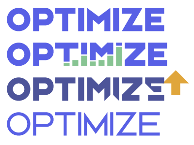
Optimize Logos v1
Rejected logos I developed around a geometric type treatment. Going with this approach allowed to incorporate icons and imagery within the wordmark itself. The second and third treatments use all 45/90 degree angles to unify the wordmark. The fourth logo as the same angle for the M and Z slants. My favorite was the third, which combined used negative space.
More by David DeSandro View profile
Like
