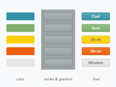
Button Styles
Experimenting with a new way to make my buttons look more consistent. I started by choosing some colors and then creating a separate layer that for a semi-transparent stroke and the subtle gradient overlay. The third column is the result of the overlaying the two. This approach is especially nice because you only have to tweak one layer's styles and can see changes reflected across all the buttons. I'm pretty pleased with the outcome. What do you think?
More by Thani Suchoknand View profile
Like
