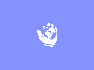
A different perpective
Hi guys, early direction for a current project, client concept :) . The needed feeling here is one of relaxation, the idea is to step out of the life's routine and to take a moment to look at things in a different manner, an outer and more calm perspective over this world. The name of the website will translate in approximately to "behold the world differently" and will comprise all sorts of articles about spiritual and personal development. The main problem here was the cliche that surround this visual, having the earth in one or two hands, all making us think about saving the earth etc. I feel that by using this color scheme and this hand position I am not close to that area, but please let me know if you feel otherwise, it's important to collect some opinions at this stage. Best to all!
