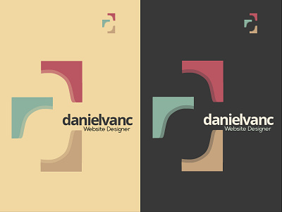
Personal logo concept
After putting together various ideas over the last week or so, this concept, particularly the mark, stuck out for me. Not based on any font, just wanted something 'serify'. Going to continue with iterations, and most likely will be altering the danielvanc. Please feel free to comment. Any advice greatly appreciated.
Backgrounds sat on 2 of the 6 colours in my scheme.
More by Daniel Van Cuylenburg View profile
Like
