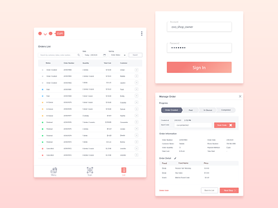
Merchant-facing Management Application
🍎An application that I'm working on with my 9-14 year old students!
I'm currently working on the merchant-facing portion (the boring app) while they will be putting together the customer-facing (the fun app).
They've chosen the primary color for this app, which makes things a bit more difficult since most management applications have a more cool-toned UI rather than a bright coral 😅It was a refreshing challenge!
🗒 Some UX notes:
- The app is intended to be used on tablet, but general mobile patterns are also accounted for smaller devices.
- Table with 5 or less items don't need zebra stripes as the purpose of the stripes are to group contents by rows and make scanning the information easier
- Status for individual orders can be presented as a progress bar to clarify users' steps and promote completion
