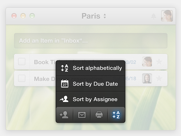
Wunderlist Action Bar
With Wunderlist Pro we introduce an new UI element, the Action Bar.
As we integrate Wunderlist deeply in our daily workflow, we discover a lot of things we want to improve and simplify. One specific problem we faced was a missing toolbar for quick access to important functions. The solution we came up with gives us the same possibilities like a normal toolbar, but in a smarter way.
To keep the focus on the list itself, the bar is hidden until you enter the bottom part of the window. So, all important actions are right there when the user needs them, but don’t distract from the main content. We also grouped similar actions in some kind of a drop down interface to be able to show text labels for better explanation of the options.
No matter what device the user has, all clients will feature the Action Bar in mostly the same way with just slightly different interactions to access it.
So if you want to learn more about Wunderlist Pro and the Action Bar, head over to our site: Wunderlist Pro
