More Portfolio UI
Hey guys,
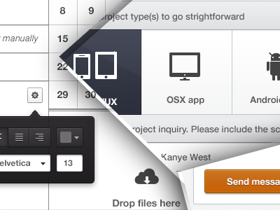
you were so kind and provided such a valuable feedback on my previous shot so I thought I'd share some more Portfolio bits with you. This is the contact form to fill with project details and stuff.
✔ To make things more strightforward I thought it would be cool to send wireframes, NDA, whatever docs the client wants to share.
✔ The top one represents the project type, you can check as mane as you like. Apparently Kanye wants an iPad app so its selected. I hate boring standard checkboxes :)
✔ Calendar is supposed to show my availablitity for the upcoming months.
✔ For fun - the font tool to play around with white typing your message. And yes, I was actually going to code that!
Let me know what you guys think. Your opinions are important in making the decision on whether to go with this design.
***
Thanks,
@Julia

