Daily ui challenge: 5 - App Icon
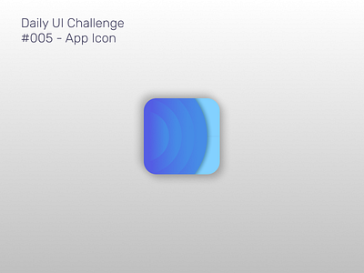
Took a crack at redesigning the Calm app: stories for meditation and sleep. I keep the original design's color story. I removed the words in the icon because that's what the app name is for. I wanted it to look like ripples of water because when I think calm, I think water rippling slowly.
