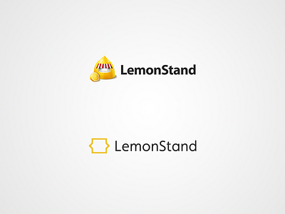
Logo development
Overview of the new final logo as compared against the previous. Replicability and simplicity aside, the legibility of the new logo really maintains itself well even at smaller sizes. Though the rounded corners of the new logo don't stand out anymore at these sizes, I think it still helps to give it a softer, more friendly look.
Thoughts?
Best viewed @2x
More by Anthony Lam View profile
Like
