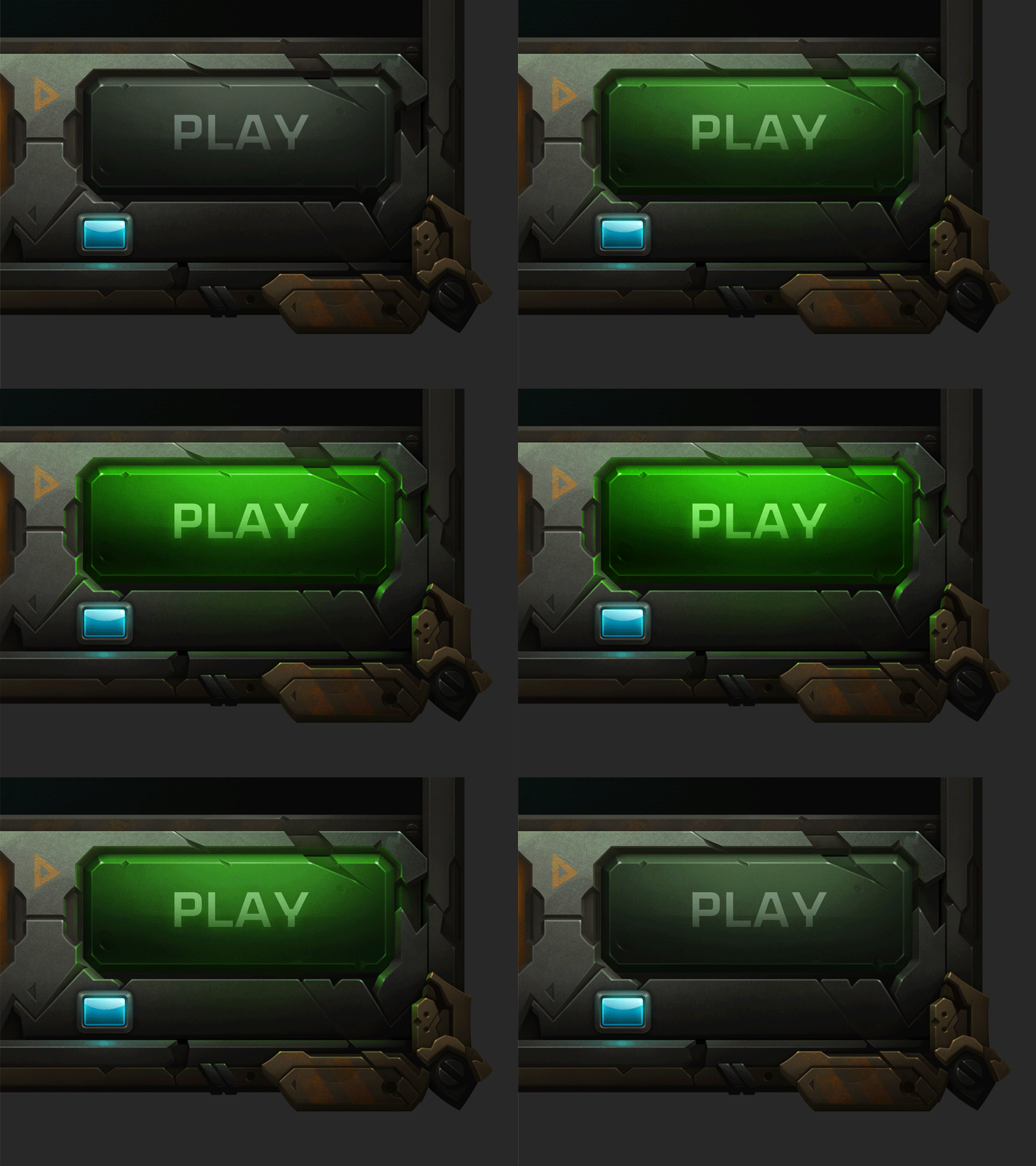
Wildstar UI Concept
Sorrounding elements for interactive areas are worn down (including buttons). My goal is to give crack/dings a purpose rather than using them sporadically. This concept is a small part of an attempt to lead the eye towards 'clickable' things. Another technique would be to soft render framing and sharpen buttons (excessively to make it obvious).
Sample in attachment.
2x
More by Miguel Duran View profile
Like


