Shortcut Bike Messengers branding
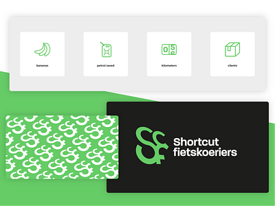
A few more bits of the branding for Shortcut Bike Messengers. The icons are used in the webdesign to show the amount of bananas all the messengers have eaten already while cycling, the petrol icon shows how much petrol has already been saved by riding bikes instead of cars, than we have the amount of kilometers ridden and the amount of clients and packages that are deliverd via Shortcut.
This is one of the patterns that is used on the website and in the rest of the branding, I will show one more pattern in the future that is used in the footer of the website and can also be used on the bottom of letters or cards.
More by Lars FlowDough View profile
Like

