Branding for Fircon Group


Hi Dribbble! I would like to present my work.
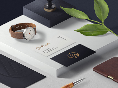
Branding for Fircon Group
Fircon is an investment company specializing in the construction industry. Crew carry out office, residential, logistics and hotel projects throughout Poland. Individual, reliable approach to the implementation of entrusted real estate management tasks, ensuring fire safety, or renting and selling real estate. Motto: Quality and customer satisfaction.
Scope of work
The creative combination of letters of the company: Fire + Construction (F + C). The whole is to resemble a benefit diagram. The circle is a symbol of the sun, hope and life. I also created a brandbook for the logo. Website done in WordPress with responsive version.
If you like 🧡 my work, it will be my motivation to create more projects.
Press key "L" to like this post.
-----
If you want to see more of my projects, check my portfolio by category:
▶️ Branding
▶️ Website
▶️ Mobile
▶️ Logo & Symbols
▶️ Poster
-----
Do you want to see more of my work? I invite you to my social profiles.
