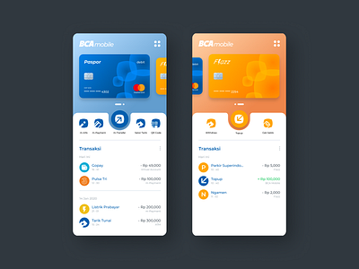
BCA Mobile UI & UX Redesign
My wife challenged me to redesign the BCA Mobile app, and of course i accepted it :)
The current app is kinda complicated and not appealing in visual aspect like it is not moving on from 2000's apps.
First thing first i try to make the BCA's electronic money, "Flazz", has top-up balance feature like some other mobile banking app.
I tried to separate the cards by making an individual menu for debit card, credit card and Flazz card. Each menu has a visual representation of a skeuomorphic card as an indication for each menu for elevating the visual aspect and making it more interactive.
I also simplified the option you can do with the card buy putting it all on the home screen (for each card) so you don't have to do much step. and then i create a transaction section on the home screen for the same reason.
in conclusion, the app is now more attractive, more easy to use and more efficient for the mobile banking experience.
