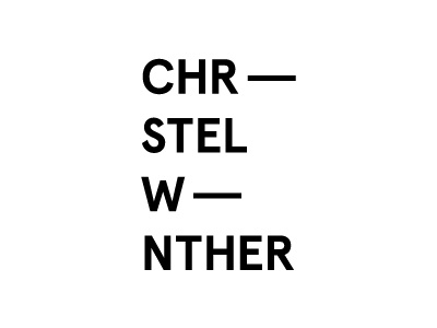
Stylist main logo - critique please
Hi,
I'm doing a logo for a fashion stylist. I would like it to be fashion but not saying stylist too much since she might want to do collaborations and other stuff apart from styling.
I have transformed the i's in her name into hyphens and made 2 variations of the logo - Her name is Christel Winther.
I can't figure out if the spacing and lineheight is good + if it's ok to have 2 logo variations.
Also check out her website which is layoutet as her moodboards. www.christelwinther.dk
Basically i'm looking for critique. Good and bad. I'm a bit rusty in the logo department so any feedback is valuable. Thanks.
Let me know if there is any questions.
/Michael
More by Michael Schlenzig View profile
Like
