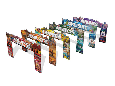
Travel Expo Archways
With the opportunity to manage the artworks side of the Travel Expo in February 2018, I implemented a wayfinding system, primarily through color that is incredibly memorable, improves navigation and builds the atmosphere of an event to bring the new expo format to life. The wayfinding system, while it is on a lot of the collateral, is best shown across a feature project: The Archways. At the beginning of the expo briefing, the new event layout was explained to me, it became clear we needed a way to make each of the zones identifiable and visually different. I believed the most effective way of making it work was through a stronger color coding and wayfinding system. So first step was to better match each zone with a color that reflects it. We decided upon:
Cruise: Light Blue (Think: Water, Horizons)
Europe: Orange (Think: Ancient Architecture, Ruins, Fresh baking)
Airlines: Purple (Think: Sunsets over water, Air NZ)
Close to Home: Yellow (Think: Sand, Warm beaches, Fancy cocktails)
Asia: Red (Think:
The Americas: Green (Think: Cactus, Machu Picchu, Football Field, Palms)
Other stuff: Expo green/Dark blue
The color coding is supported by floor decals, flyers, digi-screens, the floor map and more, and in the huge 7.4 meters long 3.75 meters tall Archways
While I was leading the project, and had the vision. I divided out the workload for creating these archways as below for efficiency:
Cruise: Myself
Europe: Megan
Airlines: Catherine
Close to Home: Sophie
Asia: Chris & Myself
The Americas: Stacey
It is awesome to see how we have improved the experience through wayfinding techniques. These have been used in each expo since
