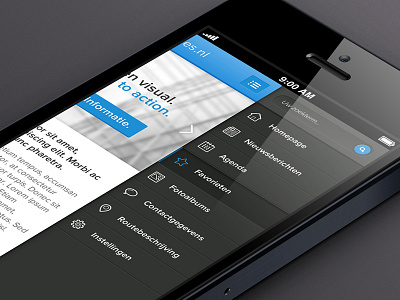
Mobile menu
Working on the look and feel of a new mobile framework. This is the menu (in the sidebar). This framework will be web-based, so it won't be an app.. Just a mobile site with nice features.
The menu is on the right side because the most people are right handed.. Thus holding the phone in their right hand and using the right thumb to navigate.
having the navigation on the top-left seems odd, its the furthest from the right thumb it could possibly be..
More by Jos View profile
Like
