Simple search
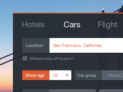
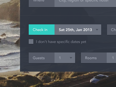
A little bit updated version. Felt like rounded corners makes it a bit more easier to use, the top menu is more simple now. Because of different space in the each of 3 types of search boxes (hotels, cars, flights) i pushed the search button down and make it ultra wide.
The white input means finished (selected). The orange / white is active (there will be drop down with calendar). The blue grey is just inactive.
More by Frantisek Kusovsky View profile
Like


