Priority Coach - UI Mobile App
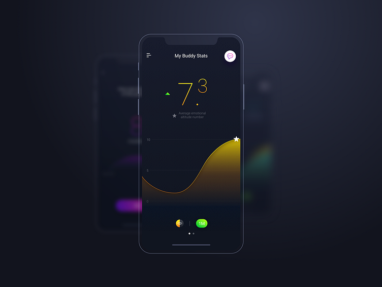
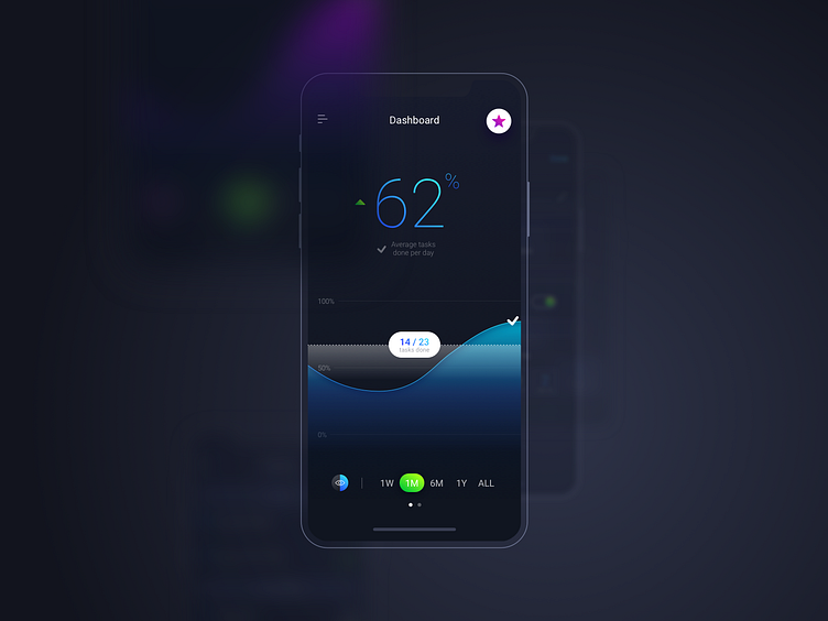
It's a mobile app design for client Priority Coach. I think dark UI is more attractive especially when it comes to data charts visualizations. Do you agree with me? Let me know in the comments below and meanwhile click 'L' or 'F' for appreciation, thanks :P
Follow me: LIPCHEV Studio | Instagram | Behance | Vimeo | Linkedin