H2O+ Sensitive Skin Packaging
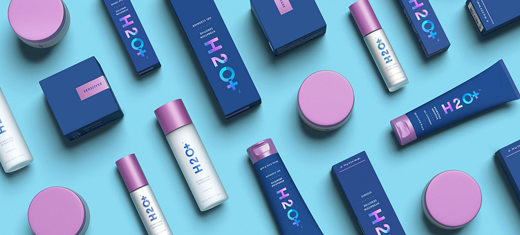
Last year, I designed a new line of sensitive skincare packaging for H2O+ which became a radical shift in their visual system and helped elevate their brand.
You can see more images from this case study, featured here: https://www.creativeboom.com/inspiration/noise-13s-ocean-inspired-packaging-for-h2o-hopes-to-sail-above-other-skincare-products/
This was done while working at Noise 13, in collaboration with Elaine Chaw.
