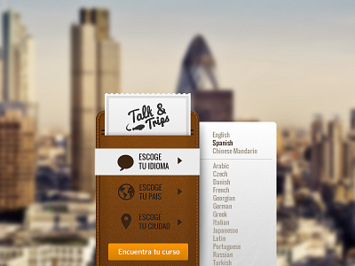
Wallet form v2
I think this is a cleaner version without the necessity of using ugly select boxes. When you click a icon, a paper slide out from under the wallet with all the selectable items. Do you think that is easy to use? (check @2x)
More by Sergio Diéguez View profile
Like

