Lucky Strike (Rebrand to the Rebrand Proposal)
Two things:
• Lucky Strike rebrands in 2013
http://www.underconsideration.com/brandnew/archives/lucky_strikes_out.php
• I'm not a fan of the tobacco industry but I do like the creative behind some of these brands.
How do you rebrand such an iconic identity? Well, you don't. When you're tasked to create an identity as a designer, the goal is always to create something timeless.
Some of these brands from the golden age of design just should not be messed with. In recent years we've seen some great rebrand (evolutions) and some plain abominations, doing a disservice to the great brands they're supposed to help.
Lucky Strike is one of the most iconic brands from the early to mid 1900's. Recently, they've decided to rebrand and change the logo all together. (link above)
In my humble opinion, the rebrand is pretty darn terrible. That slab-serif, Museo looking typeface is just horrid. Just not an iconic evolution.
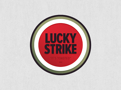
I decided to update the (now) old Lucky Strike logo with just a few minor changes that keeps the integrity of the icon.
• Updated the typeface to Proxima Nova Extra Condensed. I really like the cap height and specially the crotch of the letter's K and R.
• Brought back the "It's Toasted" in quotes and added the year.
• Gave the white-circular strip some depth.
• Added a small texture feel to the icon.
Something like this, I think, would be a more acceptable solution. Subtle changes that keep the original design in place.
Either way, I don't care much for the big tobacco, still sad to see such a great piece of design go to waste. Like a someone mentioned in the comments at UnderConsideration.com "Don Draper is going to be pissed."

