Service design agency
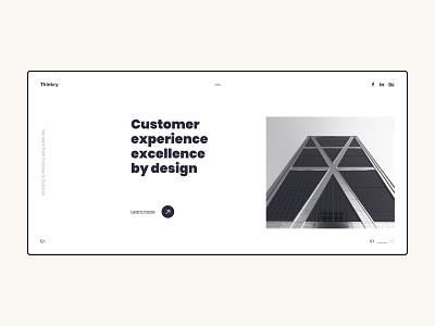
The power of the grid is deep in the details. On this landing page are a lot of information, such as – title, CTA, the slogan, socials, burger menu, logo, slider, language switcher.
Making a visual balance between all elements using a grid and negative space to concentrate all attention to the important information – creates a great user experience.
More by Anton View profile
Like
