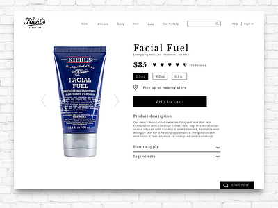
Kiehls - product page
Quick design exercise to clean up the Kiehls product page. The previous page was a link farm, full of repetitive categories and actions.
They deserve a website as clean as their products!
Hit the like if you like!
More by Jonathan Levy View profile
Like
