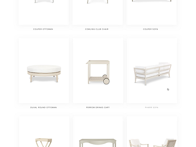
Recreating the Showroom Feel
At the beginning of this project, we had the opportunity to visit the McKinnon and Harris headquarters in Richmond, Virginia. We knew from the beginning that it was going to be important for the new site to feel like a natural extension of the McKinnon and Harris brand, so we used their showrooms and furniture as a key reference for the UI.
The physical showrooms are meticulously edited and furniture is only displayed in shades of white so that designers and direct buyers can focus on the form. Naturally, we decided to carry that approach over to the furniture page. Product images are kept to light neutrals, the white cards provide a subtle structure, and the page maintains an airy gallery-like quality.
Our goal was to make the visual transition from physical space to digital as seamless as possible, and we are quite happy with the result.

