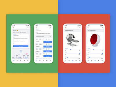
gTransit - Mobile App
Hi, hey, hello, hello!
When thinking about a transit app, there are multiple areas UX can make an impact.
• IRL: Method of transportation, location, material, environment, arrival, etc...
• Pre-boarding: ticket purchasing, destinations, number of passengers, prices, etc..
• Post-boarding: in cabin experience, seats, lighting, entertainment, meals & accommodations, etc...
I was prompted a while back to create an post-boarding cabin experience app that allowed users to tailor their in cabin experience, but the app felt incomplete without at least thinking about how a user will book a ticket, and board the train.
This Dribbble shot showcases just a few screens that I had fun creating using Google Material.
Please note, this was just for a prompt, this is not owned, or created by Google, but wanted it to be branded as if it were.
I also created a PRD, broke it into epics of how we can roll it out from an execution POV, and bundled it all in a Pitch deck that I was able to share out. The pitch deck below only covers a quick presentation, but the PRDs for each epic/milestone were written in full detail with a strategic plan to execute on.
