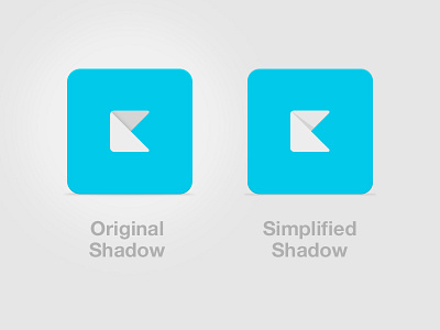
Alternate?
I thought this might be most clearly stated in graphic form. Have you considered this alternate? Just simplifies that shadow to a single vector shape. I attached the psd. It does lose the cool effect of that wrapping top left corner on the glyph though...
I want to be extra clear that I am not trying to one-up your shot, just had this 3 color version thought about papercraft (http://jxnblk.com/papercraft/) a while back and thought it might be pertinent.
kerem.psd
300 KB
More by Lucas Smith View profile
Like

