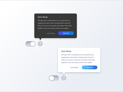
Tooltips - Light vs Dark mode
Light vs Dark tooltips! I'd often default to lighter tooltips whenever I get a chance to since I find it easier to read the content. However, some of my users expressed that they prefer the darker tooltips as it puts emphasis on the tooltip's subject. What are your preferences?
More by Jenny Tran 💫 View profile
Like
