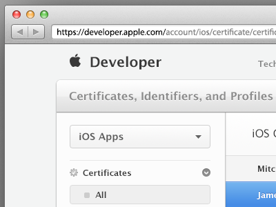
Apple Developer Facelift
I recently visited the newly updated Apple Developer Portal. And it horrified me. Those drop shadows are out of control. Not to mention a few really "attention to detail" failures on their behalf. I love Apple, but I'm very disappointed in their care for developers. I don't like it when a company prides said attention to detail, and does not cater to even the smallest of it's target audiences (developers). In this case, I decided to give one of their pages a new facelift. NOT A COMPLETE REDESIGN. Just better care towards elements. I moved a few things around, but the rest is practically the same. I'm weak in icon design, but this is good practice to see what works and why not. Let me know what you guys think!
As my own biggest critic, I believe my biggest issue with the facelift is that it doesn't have much contrast/definition between the different parts of the site. I might do a few more of these... Who knows.

