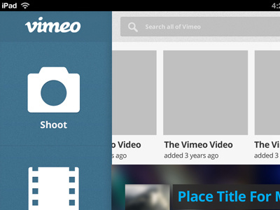
Vimeo Concept
I really love Vimeo on my ipad but I felt the app could do with being updated in terms of it's dated appearance and UX.
I quickly whipped up a new version with the following improvements;
- Search Bar being a focal point as this is the first thing I tend to go to and its simply to small on the current version. Its positioned at the top for easy of access.
- Buttons to the left have been enlarged for ease, visually pleasing.
- In the search bar Ive added a speech recognition icon as this seems to becoming more and more popular.
- Bigger touch friendly video previews.
- New clean and crispy design along with neutral colours to interfere with the subject matter playing in the vimeo...
:D
Feedback welcome!
More by Guy Morris View profile
Like

