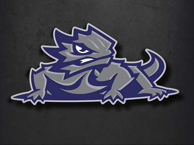
TCU Horned Frogs Concept
Just playing around with a different color scheme for my rebrand concept for TCU.
Current TCU logo: http://theamericanreligion.files.wordpress.com/2012/02/newh
I had my frog (lizard) pointed in the same direction as the original but felt it looked to stationary. So I flipped the body to give it more of an action pose. The main complaint I hear from TCU fans is that the original looks too fat. So I created more of a slender and modern look.
More by Dust Bowl Artistry View profile
Like

