Nordic Ice Logotype
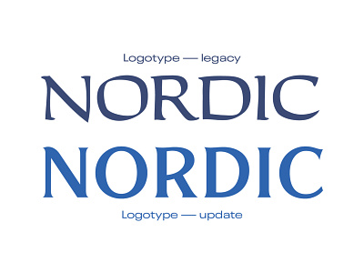


In conjunction with creating a new logo for Nordic Ice, I also updated the logotype, which at the time felt extremely dated and had been visually degraded through decades of use.
My goal was to modernize the letterforms with bolder and cleaner shapes without eliminating the general style or expression. Drawing inspiration from Alchemist by Carmel Type Co., I created these letterforms from scratch in Illustrator specifically for Nordic Ice.
See the additional slides for more of the design process and the final identity.