EU2020HR "Croatian wattle" Visual Identity Design
Entry for the EU2020HR public design competition. A formal description of the project can be found under the previous EU2020HR "Embroidery" shot.
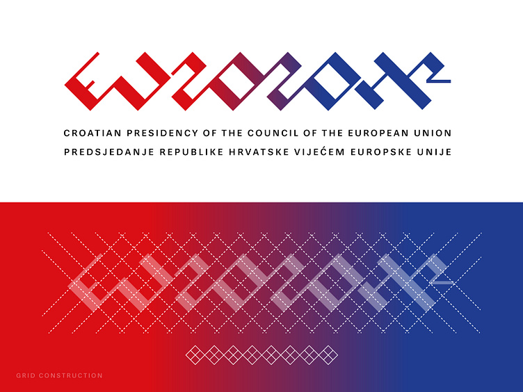
Visual identity was inspired by the Croatian interlace or wattle, known as pleter in Croatian. The most representative example is the Baška tablet.
Values that aspire to this visual identity are continuity and connection. Therefore, wattle was the main inspiration for grid construction.
Another important element is color blending. Red representing Croatian identity and blue European Union. Together they allude connection and oneness between Croatia and the EU.
Hope you like it :) Dribbbling you soon!
