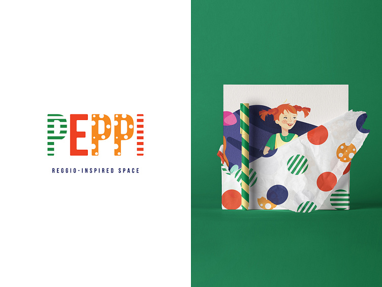
Peppi Kids Development Space Branding
Who could be more fun than the naughtiest girl in the world Peppi (originally Pippi) Longstocking to become the inspiration for the concept of kids development center? This prankish character has a few distinctive singularities that laid in the base of the brand image and the lettering logo itself. Two of the letters “P” and “I” repeat the design of her stockings, “E” is colored like her ginger red hair and the double “P” are covered with Peppi’s freckles. Overall the branding and packaging design are playful and bright to cheer up the kids and their parents when entering the development center. This logo and concept belong to Braind Branding Agency.
More by Ani Tarjumanyan View profile
Like
